




The premise needs a small correction
In a post dated 14 September, Cam Worboys describes keeping the logo, green and typography consistent while allowing other elements to adapt for kids accounts. That is a maker's account of the approach behind the shared work. It is not evidence that every Cash App team works without formal guidance, nor does a social-post date establish the original launch date of every asset. Only sampled video frames were viewed in this research. K01
BUCK's separate case study describes an evergreen 3D illustration system, a source-file library and detailed guidelines. It reports channel testing without publishing the raw results in the material inspected. We should keep these two accounts together: flexible expression and explicit guidance can coexist. BUCK's authorship of that system does not establish authorship of the September kids campaign. K07
The more interesting thesis is therefore freedom organised around recognition. A small number of persistent cues can give other elements room to respond to an audience, format or purpose. Whether those cues are sufficient remains a question for evidence rather than a conclusion supplied by the makers' confidence.
Why the family context matters
The current family pages distinguish managed accounts for children aged 6–12 from sponsored accounts for teens aged 13–17. The relationship between child, parent and service changes across those stages. That makes this a richer design problem than applying a youthful art direction to an existing adult offer. The review observes the public descriptions; it does not verify account eligibility or operation through use. K02
The central communication problem is divided attention. A child may care about personal choice and the object they carry. A parent may care about control, comprehension and what happens when something goes wrong. The brand needs to address both without asking either audience to decode the other's language.
That is why the work is a useful test of dynamism. A dynamic identity should change because the situation changes. Novelty alone would be a weaker reason. If playful imagery helps the child understand ownership while the interface helps the parent understand responsibility, the variation has a clear job.
Read the actual surfaces
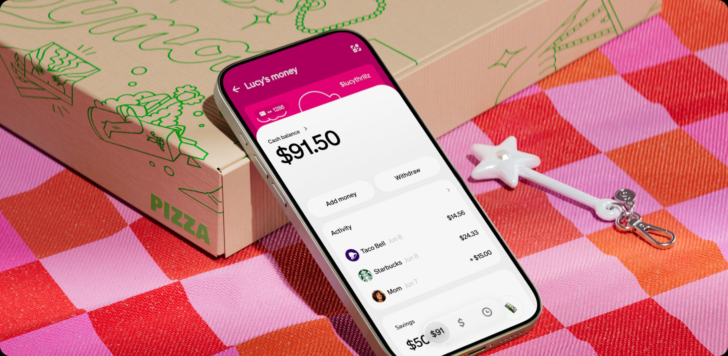
The inspected kids page moves between expressive object imagery and comparatively direct explanatory sections. Examples include a customised green card, a pearlescent star-shaped payment accessory held against blue, and a card-control interface. Green, the mark and strong typographic hierarchy recur without requiring every image to share a material or colour treatment. These are observations of the public page, not a complete inventory of the identity. K03
Our reading is that the objects do more than decorate the proposition. They make an otherwise abstract service feel touchable and individually chosen. The range between a card and a playful accessory can help express different relationships to the same service. At the same time, imagery of a charming object cannot explain a permission, resolve a dispute or establish that a parent understands a control. Each surface needs its own standard of success.
The most successful transition on this kind of page is the one from attraction to explanation. The expressive layer earns attention; the quieter layer must make the offer understandable. If readers have to leave the page to discover a fundamental limitation, visual confidence has outpaced communication. That is a test we can specify, even where we do not yet have usability results.
The physical object is part of the argument
Cash App's June Tags announcement describes a contactless payment accessory and positioned the launch for people aged 13 and above. The September kids page now presents a younger family context. These are dated pieces of evidence, not automatically a contradiction. Eligibility and rollout can change, so each claim must stay attached to its source date. K06 K03
The announcement also discloses survey provenance. One cited parent study used 1,046 US adults who were parents of teens aged 13–17. That population should not silently become “all parents” or evidence of brand recognition. The useful point for this review is methodological: a precise denominator is more valuable than a large, context-free statistic. We have not independently reproduced the study. K06
A physical accessory makes the identity's range more demanding. Material, wear, visibility in use and the social meaning of carrying it can matter as much as a screen composition. Those are productive research questions. They are not outcomes that can be inferred from a product photograph or a launch survey about interest in accessories.
A dynamic brand also has to become plain
Cash App publishes parental-control guidance and a security explanation. These materials establish what the company says its controls do; they do not prove effectiveness. At the 21 September research cut-off, the kids FAQ described merchant/category blocking as forthcoming, while the broader controls guide described blocking capabilities. Account type, rollout or terminology may explain the difference; the inspected sources do not establish which. We therefore make no claim that a specific blocking feature is available in a particular account. The communication gap is a question for the team. K04 K03 K08
Here, plain language is part of craft. A parent should be able to distinguish an available control from a planned one and a notification from an actual restriction. That does not require the safety page to look like the campaign. It requires the same service to remain intelligible when the reader's question changes.
There is historical counter-evidence to consider fairly. In January 2025, the CFPB issued an order addressing Cash App's customer-service, fraud and dispute practices. Cash App disputed the regulator's characterisation and described investments in support and protection. Both are dated primary records. They do not establish the state of the kids product in September 2026, and this review has not audited remediation. K12 K13
Their relevance is narrow but real: a friendly financial identity cannot be treated as evidence of a trustworthy service experience. This review distinguishes the quality of expression from claims about performance, while still asking whether the expression sets expectations the service can meet.
The craft judgement
Execution: a persuasive relationship between expression and explanation. The sampled page supports a range of materials and compositions without dissolving into unrelated imagery. We have not tested every viewport, motion sequence, control or assistive-technology experience, so this is a reading of the inspected work.
Distinctiveness: a strong hypothesis, not a recognition result. The persistent cues give the varied imagery a plausible centre. A useful study would remove the logo from matched examples and test correct attribution against plausible alternatives. Preference for the imagery would be a different outcome.
Fit: unusually concrete. The family context gives variation a purpose. Personal choice, parental oversight and age progression demand different explanations. The identity's strength should be judged by how well it supports those differences, not by how closely every application resembles the campaign.
Range: visibly demonstrated across public formats, only partly evidenced operationally. The corpus includes campaign material, product pages, physical objects, controls guidance and a separately documented 3D system. It does not show how internal and external makers are briefed, how exceptions are approved or how failures are corrected.
What is known about memory
For Recall, no controlled human brand study was found in the inspected corpus. For Rebuild, BUCK describes transferable materials, but no unfamiliar-operator test was supplied. For Respond, the public work provides meaningful examples of adjustment to situation; it does not establish success on an unseen brief. For Renew, the chronology gives us episodes to compare, but the creative lineage and decision history remain incomplete.
That is an evidence profile, not four hidden zeroes. Missing material limits what we can claim. It does not show that Cash App lacks the capability, and it should not punish a brand for declining to share private work.
The counter-reading
The same looseness that makes the work feel alive could depend heavily on expert curation. The original team may recognise the boundary instinctively while another team follows the visible ingredients and produces something superficial. If that is the case, a few persistent cues may describe the successful work after the fact without being sufficient instructions for making it.
This is exactly where the makers' perspective would help. We need an example near the boundary: an output that looked recognisable but was wrong for its audience, or one that broke a usual convention and was approved for a good reason. That would reveal how the system judges, rather than only how it looks.
What would change this review
A verified credit map would make attribution complete. A publishable account of fixed cues, permitted variation and rejected work would sharpen the range judgement. Independent reconstruction would test transfer. Parent comprehension research could test explanatory fit. A controlled recognition study could support a separate Memory result. None of these should automatically raise a score: evidence can strengthen, narrow or contradict the initial reading.
Questions for Cash App and its makers
- Who made the September kids work, and how does it relate to the evergreen 3D system and Tags launch?
- Which cues must remain fixed, which can change, and who decides when an exception is appropriate?
- Can you share one rejected application and the reasoning that made it wrong?
- How do you test whether parents distinguish currently available controls from planned features?
- What did another team create from the guidance, and what support did it need?
- What recognition, comprehension or longitudinal evidence can be shared with its sample, conditions and limitations?