




Start with the right credits
Primary describes its Lovable work as a kinetic identity centred on an emotional, living character. Its public project page is the primary attribution source for that identity. Offgrid separately lists Lovable campaign, out-of-home, visual-language and brand-expression work in 2026. These accounts should be credited by workstream. They do not justify assigning all current Lovable imagery to either studio. L01 L07
The distinction matters beyond politeness. If this review is going to learn from the people who made the work, it needs to know which decisions they actually owned. A question about the original mark belongs with a different evidence record from a question about how a later campaign stretched it.
Warmth has a job
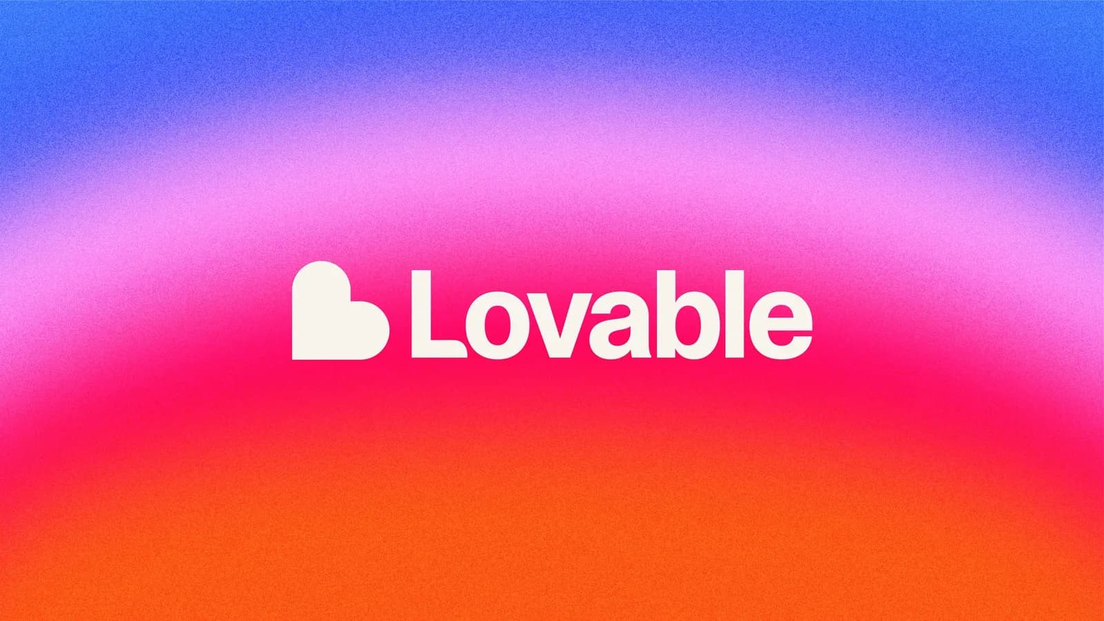
In the inspected wordmark image, a compact heart-like L and cream lettering sit against a grainy field moving through blue, pink, red and orange. The visual reading is immediate: making software can be expressive and approachable. That is an editorial interpretation of the published image, not evidence of how a representative audience responds. L01
The symbol's usefulness comes from its ability to carry a small emotional gesture. It gives the identity a centre that does not require a lengthy explanation of the underlying technology. The colour field supplies energy and variation around it. The risk is that the expressive field becomes the only remembered element. Warm gradients are easy to reproduce; a durable identity needs a more specific pattern of relationships.
There is also a question of proportion. If every communication has the emotional volume of a launch, there is little room left to signal a serious problem or a quiet instruction. A useful identity should know when to become less expressive. Calmness in a permissions screen could be an expression of care rather than a retreat from the brand.
The kit is more concrete than the mood
Lovable's official press page links to its brand hub, establishing provenance for the hub rather than leaving us to assume a similarly named site is official. The inspected logo guidance provides approved variants, spacing and misuse rules. The colour page specifies eight core hues and a set of gradient and background options. The typography page names Lovable Camera Plain and offers implementation guidance. L02 L03 L04 L05 L06
This is materially better evidence than an adjective such as “playful.” It tells another person where to begin and establishes that variation exists inside a defined vocabulary. It also creates a testable proposition: can two unfamiliar operators use the same guidance to make different, appropriate outcomes?
The existence of the hub does not answer that question. Neither does an embedded assistant, unless its outputs and their failure modes are tested. No hub assistant conversation or export was executed for this review. The operating claims should remain smaller than the enthusiasm around them.
Scale changes the burden of explanation
Lovable's 12 August 2026 announcement reports 60 million projects and 900 million monthly visits to applications built with the service. These are company-reported platform measures. Projects are not necessarily active products, visits are not necessarily unique people, and neither quantity demonstrates the effectiveness of the identity. The useful implication is the variety of people and situations the product intends to serve. L08
A second boundary follows: applications made with Lovable are not automatically expressions of Lovable's own brand. Their diversity may demonstrate platform output, but it should not be used to inflate a score for the parent identity's range. We need to inspect Lovable's own communications and product behaviour separately from its customers' authorship.
Four places to look
Hero. The identity makes an emotional case for participation. Its ambition is legible in a small set of elements. The strongest launch compositions make those elements work together; a weaker application could rely on colour alone and lose the symbol's specificity.
Habit. Typography and reusable assets in the hub give everyday production a documented basis. The next evidence should be ordinary communications made after the original identity handoff: a release note, support explanation, announcement and mobile interface. We need dates and creators to know whether range reflects one expert team or a transferable system.
Friction. The public security page discusses controls, publishing permissions and scanning. Those are the company's descriptions of its practices and features, not a security assessment performed here. For this review, the important question is communicative: does a reassuring brand help someone understand responsibility, or can reassurance obscure it? L09
Handoff. The public kit is sufficiently explicit to design a reconstruction exercise. Give an unfamiliar operator a routine product update and an uncomfortable limitation to explain. Evaluate whether both outputs remain recognisable, useful and appropriately different. That would reveal more about the system than another set of hero variations.
The craft judgement
Execution: persuasive in the core identity. The mark, type and colour world create a clear emotional centre. The sampled material is not enough to generalise about every product state or campaign execution.
Distinctiveness: concentrated in the combination. The compact symbol has more potential to act as a retrieval cue than colour alone. That is a hypothesis to test, not a measured finding. A logo-free study should distinguish a remembered mood from correct attribution.
Fit: credible, with a demanding promise. Approachability suits a product inviting more people to build software. The promise carries obligations in explanatory content: users need to understand what the system did and what they must still decide. The identity should be judged on how clearly it supports that understanding.
Range: documented in guidance, unevenly evidenced in use. The hub supports controlled variation. The public sources reviewed do not yet establish consistent quality across independent teams, cultures, accessibility needs and difficult interactions. Offgrid's listed involvement is a reason to investigate extension, not an automatic extra point.
What remains unknown about memory
For Recall, there is no controlled human study in this corpus. For Rebuild, there is a usable public starting point, but no independently assessed reconstruction. For Respond, the system offers variation; held-out situations would show whether it remains appropriate when warmth alone is insufficient. For Renew, a dated sample of original and subsequent work is needed to distinguish useful evolution from accumulated stylistic drift.
User growth, fundraising and output volume cannot stand in for those results. They may help identify relevant audiences and sampling needs, but they are not substitutes for the tests.
The counter-reading
One could argue that this identity makes a complex, consequential activity look too effortless. That critique would be unfair if based only on a colourful campaign: invitation and instruction have different jobs. It becomes useful when turned into a comparison of actual states. How does the brand speak when a build is incomplete, a permission is missing or a user is about to publish? Those examples would let the review assess the promise where it matters.
What would change this review
A successful unfamiliar-team exercise would strengthen the handoff finding. A clear set of error, permission and limitation states would sharpen the fit judgement. Recognition testing might identify whether the mark, typography or colour combination does most of the work. A documented lineage between Primary's identity, Lovable's internal output and Offgrid's later applications would make the range assessment more precise.
Questions for Lovable, Primary and later collaborators
- Which principles are fixed, and which decisions should an individual maker be free to change?
- Who owns the current hub, and how are updates communicated to teams using older assets?
- Where does the brand deliberately reduce warmth or visual energy to improve clarity?
- Which current applications belong to the original identity, internal teams and later campaigns?
- Can you share examples that looked attractive but were rejected as insufficiently Lovable?
- What evidence shows correct brand attribution, rather than general preference for the work?