





The change behind the change
Calendly announced its expanded AI product suite on 19 August: Scheduling, Payments, Contacts, Notetaker and Callie. The release reports more than 20 million users across over 230 countries. Those are company-reported reach figures, not evidence that the identity improves recognition or that every user has adopted every product. They establish the scale and complexity of the design problem. C02
A scheduling page already mediates between several people: the person inviting, the person booking and the organisation behind the meeting. Adding more products creates a second relationship to explain. The brand must tell someone where they are in the suite without making them learn a new company each time. That is why this review pays as much attention to hierarchy and handoff as to the new mark.
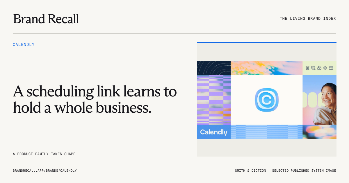
Smith & Diction describes a move towards making space for a broader business. Its account identifies an asymmetric ripple C, a connected wordmark and a related product-icon family. It names TT Neoris and Wulkan alongside Geist in the product, and credits Gavin Potenza's pattern work and Caleb Sun's product motion. The case study also distinguishes exploratory image generation from finished identity decisions. This is a maker account of intent and process; the accompanying launch compositions cannot all be assumed to represent shipped interfaces. C01
What the work is doing
In the inspected system collage, the blue centre sits among softer fields, patterned blocks, small symbols and portrait photography. Our reading is that the identity earns its warmth through contrast: one assertive organising form, then quieter material around it. The asymmetry prevents the centre from feeling like a mechanical target; the geometry elsewhere gives that looseness something to push against. This is an interpretation of the published work, not a reported audience response. C01
The most useful editorial question is whether the product family has enough difference within that shared structure. A family should reduce explanation. It should also let someone distinguish an action associated with payment from one associated with meeting capture. Small symbols have to be judged at the size and contrast in which people encounter them, not only as large launch specimens. The material reviewed establishes a design proposition; a systematic small-size and confusion test remains absent.
The same applies to typography. A richer marketing voice can give a utilitarian service personality, while a quieter product voice can keep work legible. That division becomes a strength when transitions feel intentional. It becomes a weakness if the reveal promises a character that disappears after sign-in. We have enough evidence to ask that question precisely, but not enough authenticated product coverage to settle it.
Where the brand has to live
Hero. The launch system provides a broad visual vocabulary. Its strongest feature is that it can organise several kinds of material without requiring every panel to look identical. More variety alone would not improve it; the useful test is whether each change helps explain a different job.
Habit. Calendly's release notes document mobile navigation and dark-mode changes alongside the August suite release. They are evidence of a product transition in progress, rather than a reason to treat the case-study world as the finished customer experience. A useful next corpus would follow the same invitation through mobile booking, confirmation, rescheduling and reminders. C03
Friction. The company-admin guidance describes applying a customer logo across booking pages. Calendly therefore has to share authorship in an important touchpoint. Our criterion should be successful orientation and trust, not maximum visibility for the host platform. The link-customisation guidance adds a continuity problem: changing a scheduling link can invalidate the old address. That is a documented behaviour to consider when studying brand handoffs; it is not a failure discovered through a test in this review. C06 C07
Handoff. Patternly is unusually useful public evidence because it can be operated. In a browser check, selecting Stacks changed the displayed arrangement from the initial rectangle pattern to a 238-pill layout across 14 rows. The interface exposes controls and SVG, code and PNG options; exports were not executed. This establishes that a public tool responds to input. It does not establish that an unfamiliar team can produce appropriate work without the original designers. C09
The craft judgement
Execution: persuasive in the published system, incompletely sampled in use. There is a clear relationship between centre, texture and supporting elements. Product-state and accessibility coverage needs to catch up with the breadth of the launch work.
Distinctiveness: a plausible combination, not a measured result. Blue and geometric patterns are available to many software brands. The opportunity lies in how shape, rhythm, typography and composition repeat together. A logo-free comparison could reveal which of those cues actually does the work.
Fit: the strongest part of the proposition. A recognisable parent with related but differentiated products addresses a concrete change in the business. The quieter co-branded booking experience should be assessed on its own purpose, rather than penalised for being less expressive than a campaign.
Range: supported by examples and a working tool. The evidence goes beyond one lockup. It still stops short of proving repeatable quality across teams, markets and uncomfortable situations. These findings are qualitative; no new numerical result has been calculated.
What can actually be said about memory
For Recall, we have no controlled human recognition study. For Rebuild, there is a public production aid, but no unfamiliar-operator test. For Respond, the product family and compositions show intended flexibility; held-out briefs would test its limits. For Renew, the release record makes change observable, but a new identity cannot acquire long-term continuity evidence merely by being published.
The Callie documentation also specifies language and plan boundaries. These constraints matter because a brand review should cover the service people can actually access. They do not establish whether the assistant preserves Calendly's character in a conversation; no assistant session was run. C05
A fair counter-reading
The system may be more expressive than the core task requires. Someone booking a meeting might value speed, familiarity and the inviter's identity much more than a distinctive pattern language. That is a useful challenge to the work. The case for this expansion becomes stronger if expression clarifies the wider suite while leaving routine booking calm. It becomes weaker if product distinctions add cognitive work without helping people choose.
The missing evidence is operational: real states, real handoffs and a comparison with the previous experience. Neither launch enthusiasm nor the existence of a generator answers those questions.
What would change this review
We would strengthen the judgement on execution after inspecting representative mobile, dark, error, empty and co-branded states. We would strengthen the handoff finding after seeing work made by another team from the released tools, including rejected outputs and the reasons for rejection. Confusion between product symbols would narrow the distinctiveness finding. A registered recognition study could support a separate Memory result; it would not retrospectively turn this editorial reading into a measurement.
Questions for Calendly and Smith & Diction
- Which public launch applications shipped, and which illustrate a future direction?
- What had to remain recognisable from the previous identity, and what evidence informed that choice?
- How do customer branding and Calendly's product hierarchy coexist in booking, reminders and errors?
- Which constraints are enforced by Patternly, and which still depend on a designer's judgement?
- Can another team share one successful handoff and one rejected result, with permission to publish the reasoning?
- What research distinguishes recognition of the parent brand from recognition of the individual products?